Communication Strategy: Cosmetics Brand
In the cosmetics industry, design is never just about creating a product. It is a form of communication that conveys meaning, builds emotional connections, and influences how consumers see themselves and the brand. Communication theory provides the tools to understand and control this process, turning random visual choices into a deliberate strategy. In Frost Bite, we used communication strategy to shape every aspect of the brand: from the product itself to its storytelling and visual language.
Applying narrative visual strategy: a reflection on course concepts
While studying communication theory, you realize that design goes beyond just sharing visual details. Instead, it centers on building the meaning in a certain situation, where communication depends on how people understand the concept, influenced by their own cultural experiences, personal past and way of seeing things. A key tool here is the semiotic approach, where every material, form, and visual part work as a symbol. The designer does more than shape how an object looks on the outside, they fill it with a planned set of deeper ideas.
In the Frost Bite project, things like shiny metal surfaces, the lip kit, and the color that looks like blood from veins act as symbols of inner power, beauty and the hunt for real self. The sociocultural idea points out that visual signals are tied to a group’s social customs and ways of living. The project’s key theme is centered in searching for a rare perfect shade in the realm of gothic vampires, which reflects the actual struggles of Gen Z people working to express themselves in a trend-filled world, which makes it a fresh and important message. Using the critical view, we see that design is never fully neutral, it always reflects common beliefs in society. Frost Bite highlights the strong pressures from beauty standards and the never-ending chase for perfection. It encourages people to think about these issues through the image of an endless «hunt» for the perfect color. Also, design includes a rhetorical side: the smart choice of ways to convince others with visuals. By mixing emotions, a sense of belonging to a community, and real practical advantages, it creates one strong and unified story. Communication theory guides all design choices. It shows how visual parts become a linked network of meanings and turns design into a careful process for influencing how people see things. In Frost Bite, these ideas help build a simple, well-connected, and deeply thoughtful visual story.
FrostBite: presentation for a general audience
WHY FROST BITE?
«Frost» reflects the cold gothic aesthetic and «Bite» speaks to the vampire mythology that runs through the brand DNA. This name evokes a feeling of something simultaneously beautiful and dangerous.
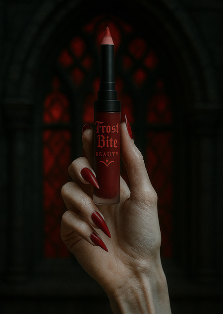
Frost Bite is more than just a lip kit. It’s a story that begins where all great legends do: in the heart of the Carpathians, where ice meets blood, and where a single choice changes everything. We create a line of decorative cosmetics for lips executed in the aesthetic of gothic vampirism. This is not merely a palette of the perfect burgundy, this is about something far deeper. This is about convenience, power, and finally finding what you’ve been searching for.
You no longer need to hunt for a lip liner that matches your lipstick shade. You no longer need to compromise. One product replaces two. One choice replaces endless searching. The ideal shade of red you’ve been desperately seeking: the color of venous blood is finally within reach.
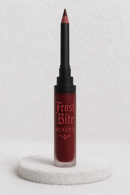
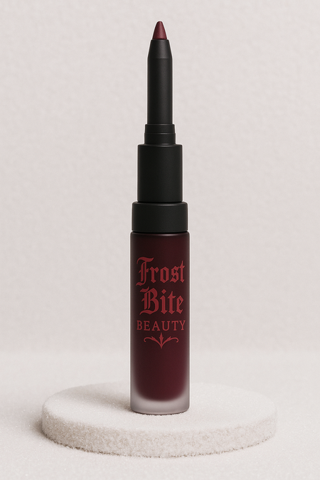
the shades of lip kits
THE TREND THAT DEMANDS YOUR TRUTH
The dark aesthetic is everywhere. Western designers parade images of Count Dracula and sensual vampires across their runways. Netflix’s Wednesday made pale skin and dark lips a global obsession and Jenna Ortega became the icon of an entire generation with her commitment to this look. This is not a passing trend. This is a cultural moment where darkness is celebrated as strength, where gothic becomes synonymous with power, and where choosing the unconventional becomes the most authentic choice of all.
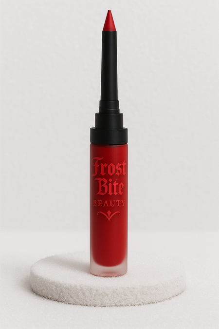

the shades of lip kits
WHAT YOU GET
Uniqueness: A focused obsession with the color of venous blood
Convenience: Lipstick + lip liner in one
Reliability: A long-wearing matte formula
Accessibility: ₽1,500 is the price of a single product
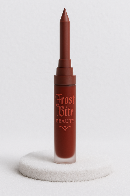
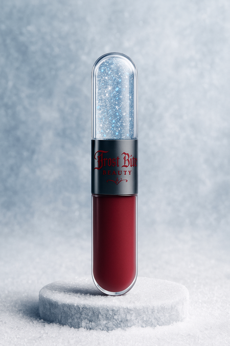
the shades of lip kits
promo
THE LEGEND
In the snow-covered Carpathians, there lived the young heiress of Count Dracula. After her first taste of her victim, she looked into the mirror and saw something unexpected: the perfect shade of red on her lips. Not her own blood, but something far more beautiful. The exact burgundy she had always imagined.
The Princess of the Winter Castle was consumed by desire — for eternal beauty, for immortality granted by endless youth. Her «ice bite» gave her lips that luxurious burgundy tone, dusted with frost. But there was a problem: the blood would dry too quickly, losing its perfect hue. The shade would fade. She would need to hunt again and again, searching endlessly for that one perfect color.
Fearing for the secret they guarded, Dracula sought out the greatest sorcerers. They promised to recreate that very shade — the one his daughter demanded.
And so, deep within the Carpathian fortress, in the castle upon the hill, a formula was born. A recipe that married the cold brilliance of ice with the passionate intensity of blood.
This is how Frost Bite was created.
FrostBite: presentation for a broad audience
Frost Bite is a brand in the decorative cosmetics sector, developing a line of lip products that embodies the gothic vampirism aesthetic. The main idea of the project comes from vampire myths. It stands for the never-ending search for something perfect that’s hard to find, like the exact shade of venous blood on the lips. This idea is brought to life in a single lip kit that combines lipstick and liner in one product. It meets everyday practical needs while also touching deeper feelings: the wish to be truly yourself and feel strong when expressing who you are
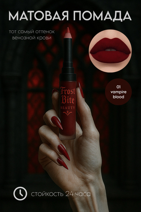
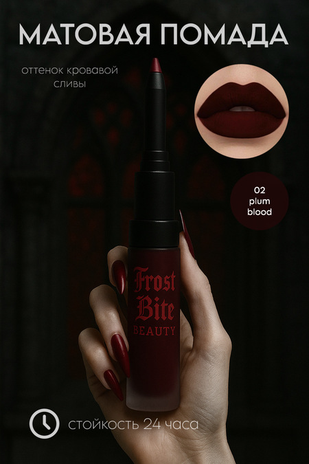
cards of products for WildBerries
The brand’s visual style is built on the contrast between cold control and strong emotion. Deep burgundy colors add raw passion and a hint of danger.
Color Palette Main colors: Deep burgundy/blood red Supporting colors: Shiny gray silver, light frost white Accent color: Black
Geometric Approach The style uses sharp corners, straight lines, and gothic details. This fits the mindset of the target group: clear choices, exact style decisions, dark aesthetics and freedom of expressing themselves
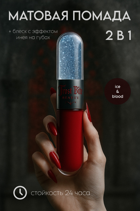

cards of the main product for WildBerries
The design of the lip kit uses simple symbols. The 2-in-1 format (lipstick + liner together) stands for ending compromises, it shows the story of finally stopping the endless search for the perfect matching pair. The project connects with common feelings among Gen Z creatives, like getting tired of too many beauty choices.
COMMUNICATION STRATEGY
A coherent system of signs, a multi-layered narrative paradigm, alignment with current cultural shifts (sociocultural tradition) deepens the project’s impact
HOW COMMUNICATION THEORY INFORMED THE PROJECT
Narrative Paradigm The course emphasizes that people understand and remember information better when it is presented as a story. The brand uses a dual-layer storytelling approach. The first layer is mythological: the legend of Dracula’s young heiress in the frozen Carpathians, who discovers the ideal burgundy tone but can never make it last, forcing her to hunt again and again. The second layer is psychological: this mirrors the real-life anxiety many young people feel when making choices in a world full of endless options and pressure to be perfect. Together, these layers turn the simple act of buying lipstick into an emotional journey. Consumers don’t just purchase a product; they join a legend and find relief from their own search for authenticity.
Semiotic Tradition All visual parts of the brand work together as a connected system of symbols. Metal surfaces stand for coldness and strict accuracy with no compromises. The venous blood color means passion. Sharp angular shapes show how dangerous beauty can be.
Sociocultural Perspective Frost Bite fits perfectly into today’s culture for Gen Z. It reflects their real-life feelings: too many trends to keep up with, using dark and gothic looks to discover and show their true identity, and getting tired from endless makeup choices. This shaped how the brand talks to people. The messages start with common emotions (like wanting something perfect that’s hard to get) and then open up bigger talks about consumer culture and how we present ourselves in everyday life.
Critical Tradition This viewpoint positions the project as a commentary on perfectionism culture and the beauty industry’s cycle of dissatisfaction. Frost Bite challenges the norm of perpetual product searching by delivering one definitive solution, encouraging reflection on imposed standards and individual empowerment.
Rhetorical Approach Rhetorical strategies vary by audience. Mass communication emphasizes emotional appeal- mythology, visual allure, feelings of power and danger. Professional communication prioritizes credibility and logic- functional advantages and conceptual rigor.
Conclusion
By grounding the entire project in communication theory, we created a strategy that goes far beyond selling lipstick. It turned Frost Bite into a meaningful cultural statement with strong emotional and intellectual depth. The theories guided every decision:
The narrative paradigm made the vampire legend, transforming a simple product into a personal story that customers want to join. Semiotics ensured all visual elements work together as a unified system of symbols, delivering a consistent and powerful brand image. The sociocultural perspective kept the brand perfectly timed with Gen Z trends, making it feel authentic. The critical tradition added depth by challenging beauty industry problems like endless consumption and perfection pressure, positioning Frost Bite as thoughtful and empowering. The rhetorical approach allowed flexible messaging: emotional and mythic for consumers, logical and evidence-based for professionals.
Why this strategy is useful?
This theory-driven approach makes Frost Bite much stronger than a typical cosmetics brand:
Higher engagement and loyalty: customers don’t just buy a lip kit, they buy a legend and a solution to their inner struggles. Clear differentiation: the gothic vampirism concept makes the brand instantly recognizable and hard to copy. Flexibility across channels: the same core idea works in social media (emotional, visual posts). Long-term relevance: by addressing timeless psychological themes (authenticity, perfectionism) within current trends, the brand stays meaningful even as trends evolve. Professional credibility: for academic, investment, or industry contexts, the theoretical foundation shows rigor and strategic thinking, making the project more convincing and valuable.
Project for HSE https://portfolio.hse.ru/Project/266692
Our process of making this project from theory to practice
Our own AI generations.
