GIRLHOOD CORNER
Communication strategy for the imaginary brand «Girlhood corner»

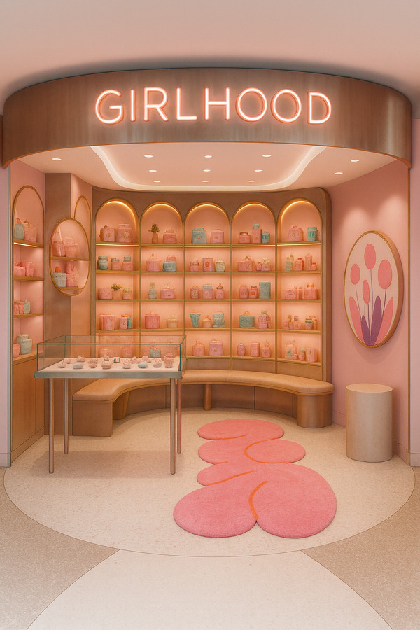
Interior design of the flagship store «Girlhood corner»
General Theoretical Part: How Communication Theory Works in Design
Communication theory examines how meaning is constructed and transmitted between a sender and a receiver through a system of signs, channels, and contexts. In the field of design, communication theory becomes a practical tool that allows designers not only to create objects, but to intentionally shape values, emotions, and cultural meanings.
Any design object — interior space, shelf system, product display, packaging, or visual identity — functions as a message that the audience interprets through personal experience, cultural background, and visual literacy. The semiotic tradition explains how visual signs work: color acts as an emotional trigger, shape as a symbolic form, material as a carrier of meaning. Rounded forms suggest softness and safety, glossy surfaces reference playfulness and artificial sweetness, while scale influences intimacy.

Interior design of the warehouse premises of the «Girlhood Corner» store
Communication theory also emphasizes the importance of channel and context. The same message is perceived differently depending on whether it appears in a physical retail space, on social media, or in close-up product displays. Additionally, the concept of communication noise highlights the risk of meaning distortion caused by visual overload or unclear symbolism. Effective design minimizes noise and strengthens the core message.
Design communication is a structured system where form directly follows communicative intention.
Presentation of the Brand for a General Audience
Brand Name: Girlhood Corner Tagline: Objects that celebrate softness, happines, and creativity.
Girlhood Corner is a design-oriented lifestyle corner dedicated to small objects of joy: hair accessories, jewelry, ceramics, and art objects created in collaboration with emerging artists. The project is built around the aesthetics of «girly things» and reinterprets them as a source of emotional comfort, play, and creativity.
The corner functions as a micro-space inside the city — a soft, intimate environment that allows visitors to momentarily slow down, explore objects, and reconnect with feelings of care and nostalgia. Rather than a traditional store, Girlhood Corner operates as a curated installation where everyday items are presented as meaningful and emotionally charged artifacts.
Holiday Interior design of the flagship store «Girlhood corner»
Target audience: Young women, creatives, introverts, and people who value aestheticized everyday life, tactile experiences, and emotional safety.
Core values:: - Playfulness and lightness - Softness as emotional comfort - Support for young artists and collaborations - Tactile and material sensitivity - Small-scale everyday joy
Communication approach:
Following the semiotic tradition, the brand communicates through soft color palettes, inflated rounded forms, glossy textures, and childlike symbolism. From a socio-cultural perspective, Girlhood Corner repositions femininity not as fragility, but as a space of emotional depth, care, and creative power.
Example of shelves at the «Girlhood Corner» store
Presentation for a Professional Audience
Example of shelves at the «Girlhood Corner» store
For designers and creative professionals, Girlhood Corner operates as a coherent communication system where space, objects, and materials function as interconnected signs.
1. Semiotic Design System
- Visual language built from symbols of softness: roundness, bubbles, pastel palettes. - Iconography referencing childhood rituals (stickers, beads, polka dots). - Packaging and spatial identity structured through non-verbal symbolic cues, following the semiotic tradition from the course.


Examples of shelves at the «Girlhood Corner» store


Textures for the «Girlhood Corner» store
2. Socio-Cultural Positioning
The brand engages with contemporary discussions on femininity, emotional labor, and softness as an alternative form of strength. The corner format encourages slow interaction, tactile exploration, and emotional connection, forming micro-communities around shared aesthetics and values.

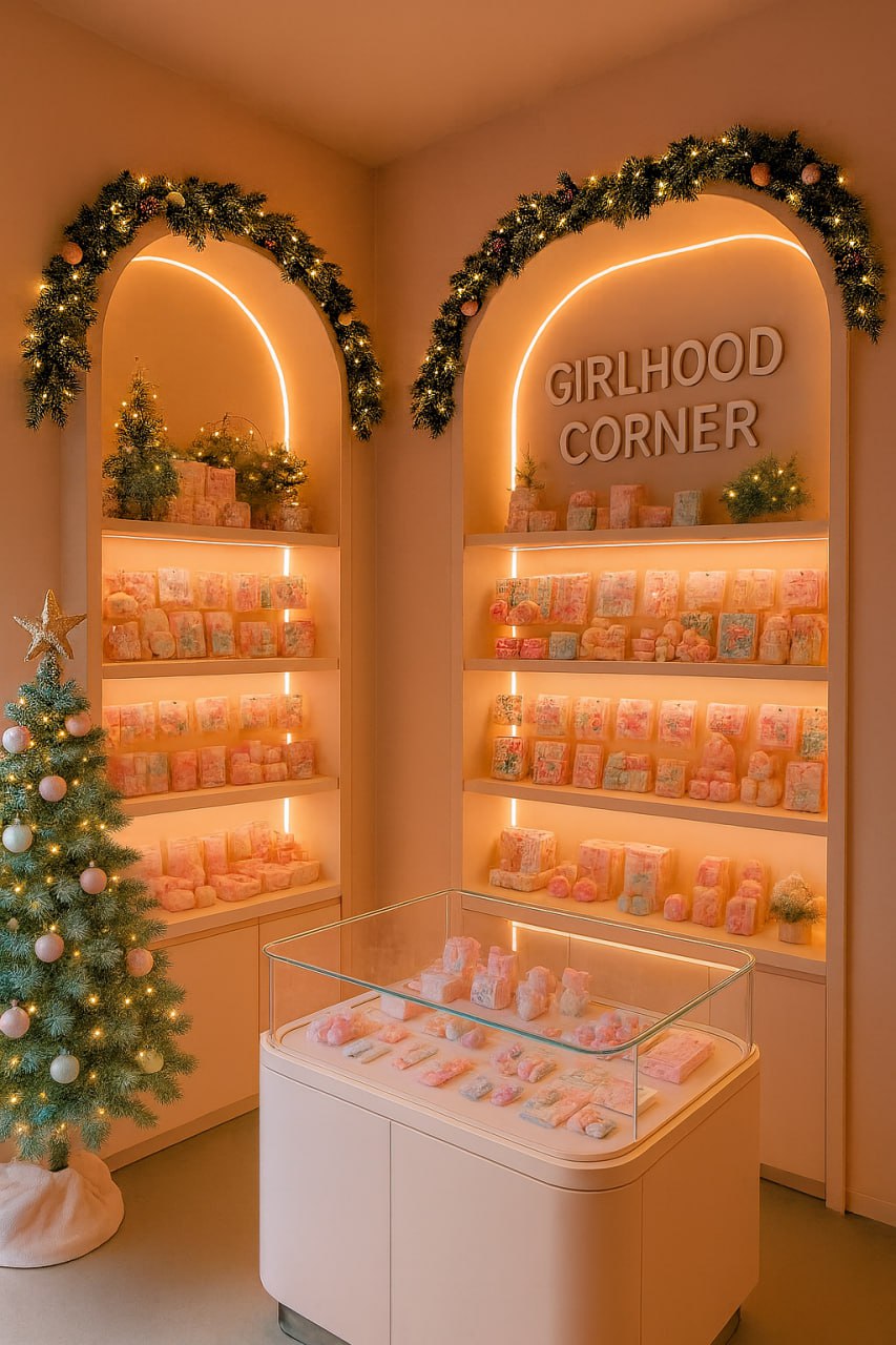
Holiday Interior design for the franchise stores
3. Cybernetic Communication Flow
The project is structured as a communication loop: sender (brand) — message (aesthetic of softness and play) — channels (physical corner, shelf close-ups, art-object stands, social media) — receiver (visitor) — feedback (UGC, sharing, purchasing behavior).
Product Strategy:
- Limited seasonal collaborations with artists; - Art objects functioning as conversation pieces; - Emphasis on tactile materials: ceramics, soft plastics, glossy finishes.
Spatial strategy:
The space is designed as an immersive environment where objects are displayed as «micro-altars of joy, ” reinforcing emotional value over pure functionality.


Styling products from the «Girlhood Corner» store
Styling products from the «Girlhood Corner» store
How Communication Theory Shaped the Strategy
1. Sender — Message — Receiver
The brand acts as the sender, the key message is the idea of softness and emotional care, and the receiver is a contemporary consumer seeking comfort and aesthetic pleasure. This model defined the central meaning of the project and guided all visual decisions.
2. Semiotic Approach
Visual signs were selected for intuitive interpretation: rounded inflated forms = safety and softness; glossy surfaces = playfulness and exaggeration; small-scale objects = intimacy; pink accents = emotional warmth balanced by neutrality.
One of the Interior design of a store «Girlhood corner»
3. Communication Levels (Emotional / Rational)
- Rational level: affordable objects, modular corner format, accessibility. - Emotional level: nostalgia, care, playful femininity. The combination of both levels ensures clear and emotionally resonant communication.
4. Channel and Context
- Each channel adapts the message: - Physical space emphasizes tactility and immersion; - Shelf close-ups focus on details and materiality; - Art-object stands highlight conceptual value; - Social media reinforces visual identity through close framing and repetition.
Minimalism in form and a limited palette reduce visual noise and allow the message to remain clear across all contexts.


Visualization of the product distribution process in the «Girlhood Corner» store
Sources
Griffin, A First Look at Communication Theory
Craig, Communication Theory as a Field
Materials from the course Communication Theory: Bridging Academia and Practice
AI-generated images created using OpenAI image generation tools.


