SFERA MAGAZIN: Communication Theory in Fashion Media
INTRO
SFERA is an independent fashion magazine built as a bridge between design practice and communication theory. In this project we treat SFERA as a full-scale brand, not only as a visual object: it has its own voice, audience, communication goals and media strategy. The magazine focuses on young creatives from Russia and uses fashion imagery, interviews and essays to tell their stories. Our aim in this presentation is to show how theories from the course can be used as practical tools to design such a brand: from understanding who we speak to, to deciding how a spread should look or what kind of heroes we choose to highlight.
[Presentation roadmap]
I. How communication theory works in design and visual media.
II. SFERA for a general audience: who we are and why we exist.
III. SFERA for a professional audience: editorial, visual and communication strategy.
IV. How course theories shaped this strategy.
V. Bibliography and image sources.
I. COMMUNICATION THEORY & DESIGN
I. WHAT WE CALL «COMMUNICATION»
Communication = a process of creating shared meaning through symbols in a specific context. It happens through words, images, layouts, fashion looks, gestures, publication formats. In design, every choice becomes a message: typography, pacing of spreads, models, styling, paper, channels.
II. WHY DESIGNERS NEED COMMUNICATION THEORY
1. Theory gives a framework: who speaks, to whom, through what, and with which effect. 2. Helps avoid random aesthetics — choices are linked to audience needs and cultural context. 3. Makes it easier to justify design decisions to clients, editors, curators, and the audience. 4. Allows us to consciously build or question norms inside visual culture.
III. OBJECTIVE VS INTERPRETIVE THINKING
Objective view: looks for patterns that work «on average» (e.g., which formats increase engagement). Interpretive view: focuses on meaning for specific groups in specific contexts (e.g., what «trash chic» means for Russian fashion kids).
IV. SFERA USES BOTH 1. Objective logic for channels and formats. 2. Interpretive logic for narratives, identities, and subcultural codes.
The course distinguishes between more «objective» and more «interpretive» approaches to communication. Objective approaches look for regularities: for example, how often people return to a platform or which formats are easier to remember. Interpretive approaches are more interested in how meaning is constructed in specific situations: how a certain visual style becomes associated with independence or underground culture. In SFERA we consciously combine both. When we think about channels and frequency of publication, we use an objective logic — what works on social media, what kind of stories keep people engaged. When we think about styling, casting and interview topics, we work in an interpretive mode — we analyse what these choices will mean for our particular audience and community.
I. CRAIG’S TRADITIONS: WHICH LENSES WE USE
We focus on several of Craig’s traditions to read and design SFERA: 1. Socio-cultural — communication as reproduction/change of social order. 2. Critical — attention to ideology, power, and inequalities in media. 3. Semiotic — work with signs and symbols; fashion as code. 4. Cybernetic / media-effects — channels, feedback loops, audience behaviour. 5. Rhetorical / PR — persuasive speech, public image, self-promotion.
II. SOCIO-CULTURAL AND CRITICAL PERSPECTIVES
1. Socio-cultural lens: media repeat norms about bodies, gender, class, and «good taste.» 2. Critical lens: asks who sets these norms, and whose voices are amplified or silenced.
III. APPLICATION TO FASHION MAGAZINES
For a fashion magazine, this means asking: 1. Which faces and bodies appear on pages? 2. Which cities and interiors are shown?
[Is it about global luxury, or about local independent scenes?]
SFERA is deliberately built as a platform for young Russian creatives, not global luxury houses.
I. SEMIOTICS: FASHION AS LANGUAGE
The semiotic tradition sees communication as an exchange of signs and symbols. Clothes, poses, shooting locations, even grain and flash are «words» in a visual sentence. By combining them, magazines create stories about identity, status, taste, and rebellion.
II. SFERA USES
1. Domestic interiors, real bodies, off-guard poses. 2. Mixed high/low styling.
III. USES & GRATIFICATIONS: WHY AUDIENCES CHOOSE MEDIA
Uses & Gratifications theory: people select media to satisfy their needs (information, identity, social connection, entertainment).
For a fashion/art magazine, typical needs include: 1. Discovering new names. 2. Feeling part of a creative scene. 3. Getting inspiration for self-presentation. 4. Escaping and enjoying aesthetic pleasure.
SFERA’s structure and visual style are designed to respond to exactly these needs.
Media ecology reminds us that media are environments. The same content feels different on paper, on a laptop screen and in a social media feed. For SFERA, the print-like PDF and mockups encourage slower, more immersive reading; social media posts are fast and fragmentary; short behind-the-scenes videos affect viewers in yet another way. Digital rhetoric looks at how arguments and identities are constructed in networked environments. This theory pushes us to think about SFERA as a multi-channel organism: not just a «magazine plus Instagram*», but a coherent set of spaces where our voice stays consistent while formats adapt. It also makes us attentive to platform etiquette: for instance, how we respond to comments or how we credit collaborators online.
I. PR, SELF-PR AND GROUP COMMUNICATION
PR theories in the course show how organizations and individuals build relationships with publics through dialogue, not just one-way promotion. Group communication and leadership theories explain how creative teams coordinate, share roles, and make decisions.
FOR SFERA THIS MEANS:
1. The editorial board works as a small creative group with clear roles. 2. The magazine builds long-term relationships with young designers, photographers, and stylists. 3. The journal itself teaches self-PR to its heroes by framing them as «faces of the industry.»
II. SFERA FOR A GENERAL AUDIENCE
SFERA is an independent fashion magazine about young creative people and the worlds they build around themselves. The focus is on Russia, but the visual language is global: our references come from experimental European and international magazines. Each issue brings together fashion editorials, long interviews, debut stories of designers and artists, as well as essays on current cultural topics. The aim is simple and ambitious at the same time: to give visibility to emerging talents and to capture the atmosphere of a generation in motion. For a general audience, SFERA should feel like an invitation into a scene that is usually visible only to insiders.
I. SFERA DNA
Three core principles of the magazine: 1. A space for experiments — new formats, risky visuals, unexpected heroes. 2. A balance of strong imagery and meaningful stories. 3. Independence from mass trends — focus on authenticity and new names rather than global hype.
II. TAGLINE
«FROM RUSSIA TO THE WHOLE WORLD»
We look at local scenes but speak in a visual language that the global fashion community understands. The magazine positions Russian creatives as equal players on the international stage. The tagline is a promise: our stories start in local districts, studios, and clubs, but are meant to travel far beyond them.
III. WHO READS SFERA?
Target audience profile, based on the project brief: 1. Age: 18–35. 2. Location: Lives in big cities or aspires to join their creative scenes. 3. Interests: Fashion, art, design, music, club culture, new technologies, sustainable lifestyle. 4. Media habits: Heavy users of Instagram, TikTok, Pinterest, Telegram. 5. Values: Self-expression, diversity, support of local brands, ethical production, experimentation.
I. AUDIENCE NEEDS
Looking at SFERA through the lens of audience needs helps refine the magazine’s offer.
1. Identity: Readers want to see people who resemble them in age, lifestyle, doubts, and ambitions. The magazine provides this through extensive portrait series and interviews. 2. Belonging: Many young creatives feel isolated in their cities or online. By showing interconnected networks of designers, stylists, photographers, and models, SFERA creates a sense of community. 3. Inspiration: Visual shoots and behind-the-scenes stories offer ideas for one’s own projects. 4. Recognition and Escape: The magazine acknowledges the experiences of its audience and lets them briefly step into a more cinematic reality.
I. PROBLEM SFERA RESPONDS TO
The project emerges in response to several gaps in existing media. 1. Mainstream fashion magazines in Russia and abroad often either ignore young local creatives or treat them as decorative additions to a brand-driven narrative. 2. Independent magazines exist, but many of them speak in highly coded, elitist ways or remain limited to narrow circles. 3. There is a lack of platforms that show emerging talents in a serious yet accessible manner — combining strong visuals, honest storytelling, and basic editorial rigour.
SFERA addresses this by giving full issues to young professionals, letting them talk at length about their work while still maintaining a clear visual and structural standard.
[OUR PROMISE]
To a general reader SFERA makes several promises. You will discover people and brands that you are unlikely to see in mainstream press. You will encounter images that are aesthetically strong but still recognisable as part of everyday life: flats, studios, streets instead of distant luxury spaces. You will get context through interviews and essays that explain how collections and projects were created, what choices were made and why. And you will feel the energy of a living scene rather than a polished marketing campaign. This promise sets expectations and guides our content decisions: if a piece does not help fulfil it, we rethink it.
I. TONE OF VOICE
1. Intimate, direct, sometimes ironic. 2. No academic jargon in public-facing texts; accessible language even for complex topics. 3. Emotional honesty: we show both success and struggle. 4. Visual tone: cinematic, slightly raw, with a mix of glamour and everyday reality.
II. VISUAL WORLD FOR READERS
1. Full-page photographs with minimal captions. 2. Layouts that allow the image to «breathe»: wide margins, simple grid. 3. Contrast between clean typography and intense, sometimes chaotic photography. 4. Motifs: domestic interiors, city outskirts, backstage spaces, nightclubs, anonymous rooms.
III. DISTRIBUTION & TOUCHPOINTS
How a regular reader meets the brand: 1. Digital-first: Instagram and TikTok as main entry points (teasers, short videos, shoot fragments). 2. Website / online portfolio: full issues and long interviews live online. 3. Occasional printed, limited-edition issues as collector objects. 4. Pop-up events and small exhibitions in creative clusters — chance to see works offline and meet heroes.
SFERA IN ONE SENTENCE:
An independent fashion magazine that turns young Russian creatives into main characters and invites the world to see their universe — through bold imagery, honest stories and experimental formats.
III. SFERA FOR A PROFESSIONAL AUDIENCE
For a professional reader — an art director, editor, curator or teacher — we describe SFERA as a platform magazine. Each issue is built around a network of collaborators: stylists, photographers, designers, models, writers. The editorial line is to treat early- and mid-career creatives as serious subjects, not as «up-and-coming» decoration. The magazine aims to document the current moment in Russian fashion scenes with enough depth that the issues can be read as archives later. We maintain a curatorial approach: themes, heroes and visual experiments are chosen to speak to each other across the pages, creating dialogue between different projects.
I. CORE EDITORIAL SECTIONS I
Professionals often want to see clear structure. 1. «Faces of the Industry» section: Usually includes a cover story with a hero of the issue, supported by an in-depth interview and an extensive photo series. 2. Portfolios: Alongside the main story, portfolios of other professionals — stylists, photographers, designers, sometimes small teams — are published. 3. Contextual texts: Shorter texts describe how the featured people work and what they are interested in. 4. Backstage pieces: Show how collections and shows are produced, revealing the labour behind the glamour.
This section establishes the human core of the issue and signals that SFERA treats its collaborators as serious practitioners.
II. CORE EDITORIAL SECTIONS II
The «Stories and Views» block contains more narrative and analytical material: 1. Debut pieces: Follow new designers or artists as they enter the industry, focusing on their decisions, mistakes, and small breakthroughs. 2. Long-form interviews: Dive deeper into specific topics — for instance, working as a couple in fashion, or balancing commercial shoots with personal projects. 3. Thematic essays: Explore questions such as sustainability, regional differences, or the influence of social media on self-presentation.
For professionals, this section is where SFERA moves beyond mood and aesthetics into reflection on practice and context.
I. ROLES AND TEAM STRUCTURE
On the organisational level, SFERA is produced by a small core team: 1. Editor-in-Chief: Responsible for the overall concept of each issue, selecting heroes, and shaping the tone of interviews and essays. 2. Art Director: Develops the visual language, defines references, supervises castings, and collaborates with photographers on shoots. 3. Graphic Designer / Producer: Builds the physical structure of the magazine, coordinates deadlines, manages communication with all collaborators, and prepares files for publication.
Around this core, project-based teams orbit each issue: each shoot has its own stylist, photographer, set designer, makeup and hair artists, and assistants. Clear crediting on pages reflects this network and builds professional visibility for everyone involved.
[Visual system: typography & layout]
I. TYPOGRAPHY
Narrow sans serif with an industrial feeling. Large titles, tight leading — a reference to independent European fashion magazines.
II. LAYOUT
1. Double-page spreads with asymmetrical image placement. 2. Long interview columns set in small type, forming visual texture. 3. Use of black/white blocks to highlight quotes and metadata.
Design choice supports the message: SFERA is serious about content but stays raw and energetic.
III. VISUAL SYSTEM: PHOTOGRAPHY
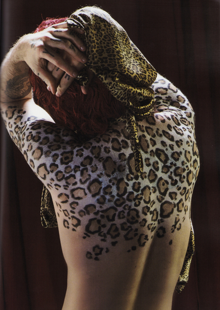
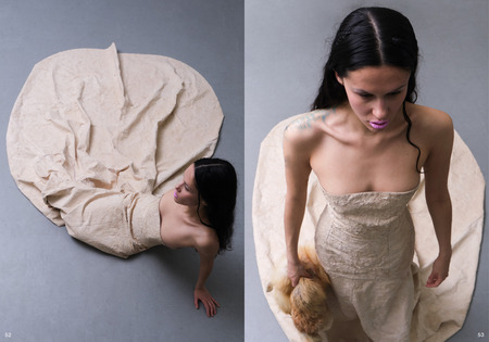
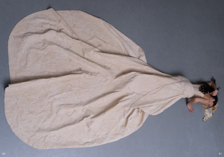
Photographic language: 1. Natural or hard light, visible grain, flash. 2.Unusual angles and cropping. 3. Real spaces instead of studio perfection.
Casting: Mix of professional models and people from creative circles. Styling: Clash of vintage, local brands, and DIY elements. Result: Images feel more like stills from underground films than conventional fashion spreads.
I. SEMIOTIC ANALYSIS: WHAT SFERA «SAYS» VISUALLY
From a semiotic perspective, we can read SFERA’s imagery as a coherent statement: 1. Empty or sparsely furnished rooms suggest transition, mobility, and a lack of stable, safe spaces — a common condition for young creatives. 2. Poses showing vulnerability, awkwardness, or defiance distance the magazine from standard fashion catalogues. 3. Tattoos, scars, unshaved legs, unconventional hair emphasise individuality and resistance to polished beauty norms. 4. Frequent appearance of local brands, vintage pieces, and DIY elements signals a critical attitude towards global luxury and an interest in alternative economies.
Together, these signs construct a story about a generation that is resourceful, fragile, and stubbornly creative.
II. CHANNEL STRATEGY FOR PROFESSIONALS
Although SFERA is conceptualised as a printed magazine, in practice it is distributed mainly as a digital artefact. 1. High-quality PDFs and 3D mockups show how the issue would look on paper and fit well into design portfolios. 2. Social media strategy: Each launch is treated almost like a campaign, with teaser posts, short videos from shoots, and curated carousels of images to concentrate attention and avoid content fatigue. 3. Professional platforms (e.g., Behance): The project is presented with additional commentary on concept, process, and reference points, making it legible as a design case study.
III. [RISKS AND LIMITATIONS]
1. Niche positioning and edgy aesthetics can limit commercial advertisers. 2. Focus on the Russian scene may be sensitive in a global context; requires careful communication. 3. Heavy reliance on a small creative circle risks becoming closed and repetitive. 4. Financial sustainability: limited print runs and experimental visuals require alternative funding (grants, partnerships, events).
[POSITIONING MAP]
I. How SFERA sits among other references (Re-Edition, 032c, Buffalo Zine, Middle Plane):
II. Mainstream glossies — global brands, commercial focus, safe aesthetics.
III. Conceptual mags (032c, Middle Plane) — art + theory heavy, often international in scope.
IV. Playful zines (Buffalo Zine) — format experiments, irony.
V. SFERA — local Russian focus, strong but accessible visuals, mid-level theorizing, more intimate connection to grassroots scenes.
Behind the aesthetics and structure, SFERA has a set of values that guide its work. We are committed to giving space to local creatives rather than chasing collaborations with big international brands. We try to represent a wide range of bodies, gender expressions, identities and regions, even within limited resources. We pay attention to questions of sustainability and ethics, favouring brands and practices that reflect these concerns. On set we aspire to maintain healthy working conditions: reasonable hours, clear expectations, respectful communication. Proper crediting on pages and online is non-negotiable. For a professional audience, these values are not decorative; they signal what kind of partner SFERA can be.
IV. HOW COMMUNICATION THEORY SHAPED SFERA
OVERVIEW OF THEORIES WE USE
We explicitly work with: Uses & Gratifications. Group communication and leadership. Semiotic tradition. Socio-cultural and critical traditions. Media ecology / digital etiquette. PR and self-PR models (excellence, dialogic).
USES & GRATIFICATIONS → CONTENT AND FORMAT
Theory insight: audiences actively seek media that answer their current needs (identity, information, connection, entertainment).
DESIGN DECISION:
build issues around «faces» and «debuts» to satisfy need for identification; provide long interviews and essays for informational and reflective needs; invest in strong imagery for aesthetic pleasure.
EXPECTED EFFECT:
higher involvement, because magazine solves concrete tasks for readers (find community, get inspired, learn how others made it).
I. OVERVIEW OF THEORIES WE USE
We explicitly work with: 1. Uses & Gratifications 2. Group communication and leadership 3. Semiotic tradition 4. Socio-cultural and critical traditions 5. Media ecology / digital etiquette 6. PR and self-PR models (excellence, dialogic)
II. USES & GRATIFICATIONS → CONTENT AND FORMAT
Theory insight: audiences actively seek media that answer their current needs (identity, information, connection, entertainment).
III. DESIGN DECISION 1. Build issues around «faces» and «debuts» to satisfy the need for identification. 2. Provide long interviews and essays for informational and reflective needs. 3. Invest in strong imagery for aesthetic pleasure.
IV. EXPECTED EFFECT
Higher involvement, because the magazine solves concrete tasks for readers (find community, get inspired, learn how others made it).
Inside the team, we experienced in practice many points discussed in the group communication part of the course. Without clear roles, meetings quickly slipped into confusion and nobody felt truly responsible. After formalising responsibilities — who decides on themes, who approves visual concepts, who controls schedule — collaboration became smoother. We also tried to practice shared leadership: different members could lead specific sections or shoots based on expertise, while others supported. Regular review sessions after key milestones allowed us to learn from mistakes instead of repeating them silently. This kind of structured communication is invisible to readers, but it is crucial for delivering a consistent issue.
[Semiotics → visual language]
I. SEMIOTIC THINKING IN VISUAL DECISIONS
Semiotic thinking pushed us to look at images not only in terms of aesthetics but also in terms of codes and connotations.
1. Framing choices: For example, showing branded shopping bags prominently versus hiding them changes the message. 2. Environmental symbols: A single bare bulb in a room creates specific associations. 3. Camera angles: Different heights influence the perceived power of the subject. 4. Breaking expected codes: ·Choosing older or very young models in contexts where youth fashion usually shows only one age band. ·Pairing glamorous make-up with deliberately ordinary environments.
By making these choices consciously, we could articulate the magazine’s visual stance and avoid unintentional contradictions.
[Socio-cultural & critical traditions → choice of heroes]
I. SOCIO-CULTURAL AND CRITICAL FRAMEWORKS IN CONTENT
The socio-cultural and critical frameworks led us to ask: if we had complete freedom, whom would we show on our pages? And what happens if we simply follow our first impulses?
1. Reflection on privilege: Often, those impulses mirrored existing hierarchies — relatively privileged people from central cities with certain looks and connections. 2. Expanding representation: Recognising this, we tried to include voices from different backgrounds. 3. Addressing structural issues: Interviews became a place to discuss unstable incomes, unpaid internships, regional inequalities, and gendered expectations in fashion.
The magazine does not pretend to solve these problems, but by naming them, it contributes to a more honest conversation inside the field.
I. MEDIA ECOLOGY & DIGITAL RHETORIC → CHANNEL MIX
Theory insight: Channels influence how messages are felt; online communities create specific forms of presence and etiquette.
DESIGN DECISION: 1. Keep long reads and full spreads in PDF/web format that invites slow consumption. 2. Adapt imagery into short, vertical clips for social media. 3. Maintain different «temperatures» of communication: cool, curated magazine vs. warmer, more informal stories and lives. EXPECTED EFFECT: 1. Coherent brand that behaves differently but recognisably across formats. 2. Stronger sense of community around the magazine.
II. PR & SELF-PR → RELATIONSHIP WITH HEROES AND READERS
Theory insight: Modern PR emphasises two-way dialogue, relationship management, and ethical communication, not manipulation.
DESIGN DECISION: 1. Treat heroes as partners: involve them in shaping narratives, share material before publication. 2. Use social media to listen to feedback and refine themes. 3. Help talents craft their self-presentation through interviews and styling, effectively teaching self-PR. EXPECTED EFFECT: 1. Long-term trust with featured creatives. 2. Magazine perceived as an ally and platform, not exploitative media.
Looking back at the process, we can say that communication theory helped us in three main ways. First, it gave us language to describe what we were intuitively doing and to refine it. Second, it offered ethical and political frameworks that prevented us from reproducing some of the more problematic patterns of fashion media. Third, it connected our small studio project with a wider field of academic and professional discussions, making SFERA feel less like an isolated exercise and more like a legitimate participant in ongoing debates about media, culture and representation. In this sense, SFERA is not only a magazine about young creatives; it is also a practical experiment in «bridging academia and practice».
V. BIBLIOGRAPHY & IMAGE SOURCES
In the bibliography we will list the core materials from the «Communication Theory: Bridging Academia and Practice» course: lecture notes, slides and recommended readings. Here we simply acknowledge that this project is built directly on those materials. Concepts such as communication traditions, Uses & Gratifications, media ecology, PR models, group communication and critical perspectives all come from the course framework. We deliberately kept the terminology consistent so that teachers and fellow students can easily see how the theory has been translated into design decisions in SFERA.
Beyond the course, we also consulted texts on independent fashion magazines, visual culture and semiotics of fashion. These sources helped us contextualise SFERA among other media projects and sharpen our vocabulary when talking about images, bodies and clothes. In the final list we will include key books and articles on fashion media, youth culture and contemporary Russian creative scenes. For the purposes of this presentation it is enough to state that SFERA is grounded not only in intuition and taste, but also in existing research and critical discussion.
[Images and texts credits]
All photographs and written materials in this issue of SFERA were created specifically for this project by our team. The photography is authored by Yaroslav Dyukov, and all editorial texts are written by Alina Fomina, with additional editorial work by Ekaterina Dementeva. Every image is original, produced in our own shoots rather than taken from external sources, and all visual and textual content is protected by copyright and belongs to us as the creators.
[Team & acknowledgements]
The SFERA project was developed by a small editorial and design team of three students, each combining several roles: concept development, art direction, graphic design, photography, research, and writing. We also extend our thanks to all participants who contributed their time, stories, and images. This closing acknowledgment highlights one of SFERA’s core messages: behind every photograph and spread is a network of people whose work deserves recognition.
Course «Communication Theory: Bridging Academia and Practice»: lectures 1.1–1.6, 4.4–4.5; module on critical theory, Marxism and the Frankfurt School (ideology, culture, culture industry, public sphere) [Electronic resource]. — Electronic text data. — 2025. Accessed 01.12.2025.
Dainton, M., Zelley, E. Applying Communication Theory for Professional Life / M. Dainton, E. Zelley. — Thousand Oaks: Sage, 2015. Accessed 08.12.2025.
Griffin, E. A First Look at Communication Theory / E. Griffin. — New York: McGraw-Hill, 2012. Accessed 11.12.2025.
McQuail’s Mass Communication Theory. — 6th ed. — Los Angeles; London; New Delhi; Singapore; Washington, DC: Sage Publications, 2010. — 621 p.
Theorizing Communication: Readings Across Traditions. — Thousand Oaks, CA; London; New Delhi: Sage Publications, 2007. — 608 p.
All pictures are from our originally SFERA project: https://hsedesign.ru/project/dcb4ed692fdc4851903cc81e192b4fc5


