VELD
Communication is a process of generating meaning by sending and receiving verbal and nonverbal symbols and signs that are influenced by multiple contexts.
There are always at least two participants — sender and receiver — and their interaction is shaped by the situation, such named as context. Communication theory studies each element of this process: who speaks, how the message is encoded, through which channel it acts, and how it is decoded.
In design, communication is first of all the transmission of a message about a brand, product, service or event from an organization to its audience (B2C or B2B). Visual and material choices are not neutral: they work like messages that inform, persuade, invite or exclude.
Communication theory in the design field connects objective and interpretative approaches. From an objective perspective, a designed object can be described through visible and measurable parameters — form, colour, material, layout, affordances — and their effect on perception and behaviour. From an interpretative perspective, meaning depends on the user’s prior experience, culture and current context. Communication theory links these views and treats design as a process in which meaning is partly built into the object and partly produced in use.
To analyse how meaning is created, Robert Craig proposed seven communication traditions. Applied to design, they show that an object never have only one way of determining.
The semiotic tradition focuses on design as a system of signs: typefaces, textures, icons and colours work like words in a language.
The phenomenological tradition looks at meaning in lived experience: how weight, temperature, sound and tactility shape what an object «feels like».
The rhetorical tradition treats design as persuasion: compositions, hierarchies and material contrasts can change attitudes without any explicit text.
Together, Craig’s traditions allow us to see design as a communication process in which meaning is constantly negotiated between designer, object, user and context, rather than fixed once and for all.
Maple Slab Low Table. By Ethan Stebbins. 2020.
In this project, the key theoretical lens is the Elaboration Likelihood Model (ELM) by Petty and Cacioppo. ELM explains how people process persuasive messages through two main routes:
1. the central route, when a person is highly involved and carefully evaluates arguments;
2. the peripheral route, when there is little time or motivation, and decisions are based on simple cues such as style, prestige or emotional tone.
For design, this means that any artefact or visual identity works on both levels at once. The central route is activated when a person reads detailed information, compares features, tests a prototype or explores an interface in depth. Here, clear structure, honest information architecture and well-reasoned design decisions act as strong arguments.
The peripheral route is activated in quick encounters: a passing glance at packaging, a social media post, a storefront or an image on a website. In these situations, typography, colour palette, composition, materials and photography serve as peripheral cues that signal quality, status, mood and values in a fraction of a second.
Using ELM in design practice means intentionally planning both levels:
- deciding which arguments should be available for central processing (detailed specs, diagrams, usage scenarios),
- and which visual and material cues will support peripheral processing (visual weight, contrast, tactility, atmosphere).
Thus ELM helps designers work not only with a «nice visuals», but a structured persuasive system that addresses different levels of attention and involvement
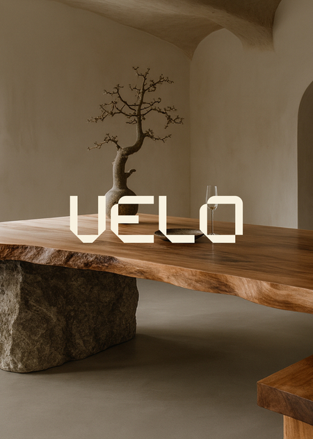
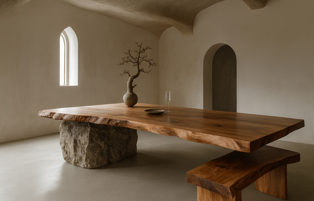
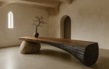
This project presents a brand of furniture made from natural materials called VELD.
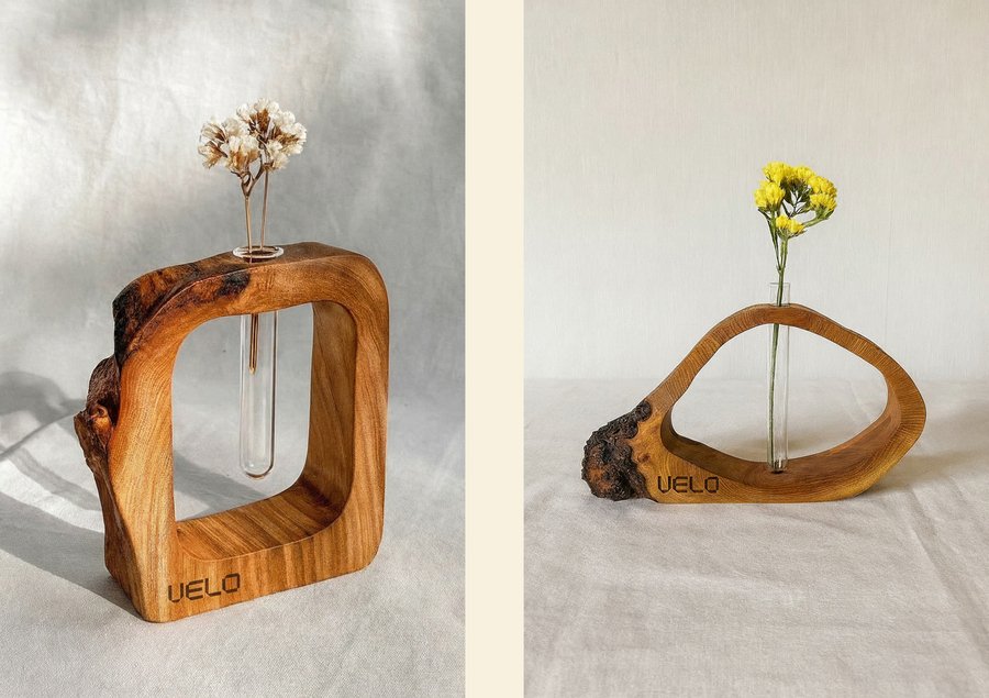
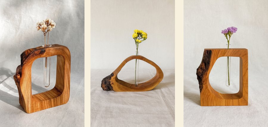
VELD is furniture at the intersection of object and architectural design. Large forms made of solid wood and natural stone with minimal processing work not as decor, but as material accents of the space. Each object is a monolith that sets the rhythm of the interior and gathers life around itself.
The brand is aimed at an above-average income audience that chooses less, but better: long-term investments instead of seasonal purchases. VELD speaks through mass, proportions and texture, not through jewelry — honest materials, visible structure and tactile roughness become the main language of communication.
Special attention in communication is paid to the feeling of time dilation and the experience of human interaction with the material. The brand strives to make people feel the warmth of wood, the cold of stone, and the weight of the structure through honest forms and slogans of advertising media.
VELD is an online furniture and interior items store operating on the principle of a «closed workshop». The main showcase of the brand is a website where the user gets acquainted with the collection: tables, chairs, beds, bedside tables, tables, vases and small decorative objects made of wood and stone. If it is important for a person to see an object not only on the screen, but also in the material, he can, by prior arrangement with the manager, come to the workshop and personally look at the selected product, touch the texture, feel the weight and scale.
The format of the «closed workshop» is associated with the phenomenological tradition: communication takes place not only through the screen, but also through the experience of presence. A visit to the workshop is a continuation of an online message in physical contact with an object: the cold of stone, the warmth of wood, and the roughness of the edges complement the brand’s image at the sensory level. The brand does not impose a ready-made meaning, but creates conditions in which a person himself «reads through» the subject through his own experience.
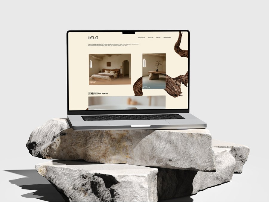

The VELD website is primarily a communication in a digital environment where both the semiotic tradition and the ELM Collaboration Model work. In the online catalog, the color, rhythm of the cards, typography, and photographs act as a system of signs: silence, massiveness, and slow tempo are read through visual language. For those who browse the site fluently, these elements work as peripheral signals (according to ELM) — they immediately give a sense of the brand. For a more engaged user, the site offers detailed descriptions of materials, sizes, assembly and maintenance conditions — this is already the central way of processing when the decision is based on arguments.
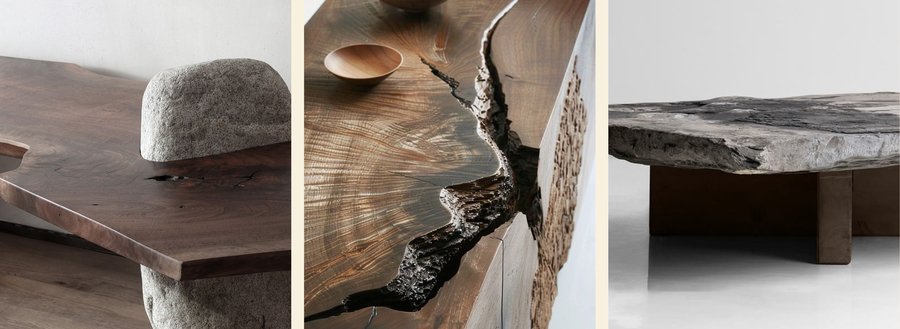
Mudboard
VELD’s target audience is people with above—average incomes, for whom home and work space are a way to slow down and bring tangibility back to life. These are owners of urban apartments and country houses, architects and creative specialists who are sensitive to materials and tactility. For them, it is not so much the «presence of furniture» that is important, as the experience of interacting with it, as well as conscious and environmentally friendly consumption. They like to travel, relax in nature and have the means to do so.
At the same time, interior designers, architects and investors engage with the brand through the central route: they look for evidence, numbers and guarantees. For them VALD must provide a deeper narrative and transparent logic.
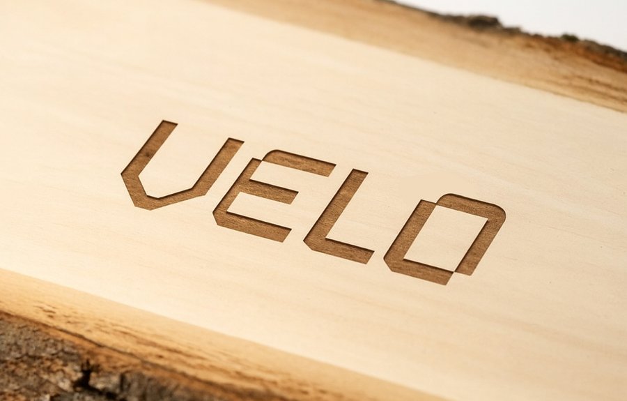
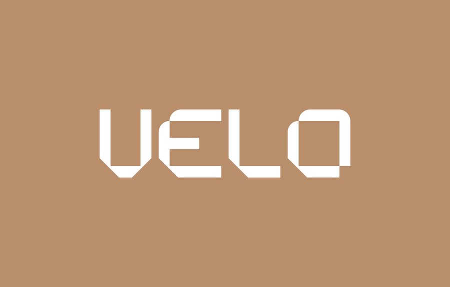
The VELD logo is based on geometric shapes with characteristic beveled corners, which are repeated in each letter and read as a visual trace of «material processing». This is not only a formal technique, but also a visualization of the workshop’s work process: a stone or wooden block from which excess is «removed» until a clean structure remains. The areas smoothed by the radius are adjacent to the hard sections and metaphorically convey the difference between the textures of wood and stone — warm, tactile and cold, monolithic.
The bold, fully typographic design was chosen so that the sign would work confidently on different media and methods of application — from engraving and embossing to silkscreen printing and digital interface. The logo does not «scream», but creates a stable sense of the brand’s presence in the background: it is accentuated enough to attract attention, but neutral enough in form not to argue with the texture of wood, stone and interior context, but to enhance them.
Contrasting shades of wood and stone were chosen as the main colors — beige and gray colors with different tones.
In addition, complementary colors allow you to work with warmth in design, to convey more deeply the idea of sensations, tactility and arrays of natural materials.
VELD’s graphic idea is based on a combination of flexible and straight shapes, reflecting the meeting of stone and wood in the brand’s objects. In typography and layout, the rigid verticals and beveled corners of the logo, the modular grid, and rectangular blocks of text «hold» the design, while the soft radii, large margins, and smooth contour lines in illustrations and pictographs act as the visual equivalent of the tactile smoothness of a tree. In printing and on business cards, this is emphasized by the texture of the media: thick matte paper and rough edges, imitation of engraving or embossing create a feeling of mass and depth, like a stone, while warm shades and natural air fields refer to living material. This is how the brand’s graphics become a visual model of its objects — an accurate but calm dialogue between hard and soft, constructive and sensual.


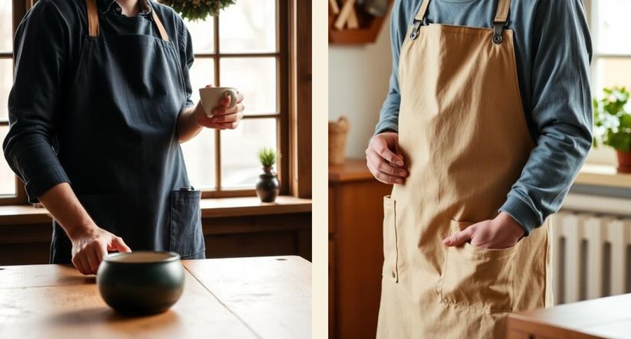
The merch project is supposed to be created as a continuation of brand communication beyond the «big» items. rand divides it into two lines, strictly tied to the scenarios of furniture use. Textile aprons and towels made of dense natural fabrics are being developed for dining room and kitchen products (dining tables, chairs, dressers, cabinets, sets). They have laconic branding and texture of the fabric material.


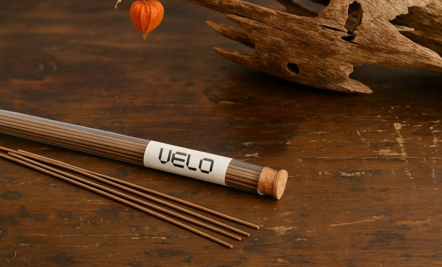
For bedroom and living room furniture (beds, work tables, benches, armchairs), a more contemplative line of merch is created — small figurines and incense sets made with the same combinations of stone and wood. These are peripheral signals in ELM terms: even at a cursory glance, they support the image of a «slow—motion» space where rituals of rest and concentration are important.
Semiotic, textiles, sculptural objects, and smoke from incense become signs of concern for everyday gestures and moods, and rhetorically, the whole merch works as a soft argument: not just «buy an item,» but «assemble a whole life scenario around it.»
In the previous section, it was already pointed out that when working with presentations, there is an emphasis on the theory of communication called the ELM Model, and its main principles were mentioned there. For the presentations of the Veld brand, a strategy was chosen that simultaneously supports peripheral and central processing paths.
For a wide audience, the key focus is on peripheral signals: large-scale images of furniture, wood and stone textures, posters and publications on social networks. The mass of shapes, natural light, minimalistic layout and concise slogans embed codes of durability, tranquility and materiality into the visual stream, without requiring long-term cognitive work from the viewer. Short explanations and captions add a central layer — arguments about honest materials and hand-made, but remain secondary to the image.
A professional presentation, on the contrary, enhances the central route. The longrid for designers and architects reveals in detail the logo, the color system, the typographic solution, the graphic idea of combining soft and hard shapes, as well as merch and media. Here, the rhetorical tradition manifests itself in a clear division: the demonstration of production techniques supports trust, structured blocks about font readability, logo adaptability and media system perform a rational argumentative function, and visual interior cases create an emotional background.
Craig’s semiotic and phenomenological traditions define work with form and experience. In both types of presentations, materials and geometry are described as signs: solid wood and raw stone encode stability and connection with the earth, and the beveled and smoothed corners of the logo are a metaphor for combining heterogeneous textures.
According to the ELM tradition, each block works both as a signal and as an argument. The signal is for peripheral perception (texture, silhouette, logo, slogan), the argument is for central perception (figure, diagram, specific usage example).
Using the theoretical prism of the development probability model, as well as semiotic, sociocultural and rhetorical traditions, the study shows how:
A furniture brand can be designed as a communication system, not just as a set of objects.;
The material, shape, texture, typography, and text become arguments and prompts in the persuasion process.;
Different audience segments (the general public and professionals) require a different ratio of basic arguments and peripheral signals.;
Design solutions can consciously contribute to a broader discussion of sustainability and time in culture.
In this way, VALD becomes a concrete example of how concepts from a communication theory course can be translated into visual identity, product design, and brand storytelling.
Communication theory: bridging academia and practice [Электронный ресурс]: online-курс / National Research University «Higher School of Economics». — EDU. HSE. Smart LMS, 2025.
Petty, R. E., & Cacioppo, J. T. Communication and Persuasion: Central and Peripheral Routes to Attitude Change. New York: Springer, 1986.
Craig, R. T. «Communication Theory as a Field.» Communication Theory, 9(2), 1999.
Barthes, R. Mythologies. Paris: Seuil, 1957.
Hall, S. «Encoding/Decoding.» In Culture, Media, Language. London: Routledge, 1980.
McQuarrie, E. F., & Mick, D. G. «Visual Rhetoric in Advertising: Text–Interpretive, Experimental, and Reader-Response Analyses.» Journal of Consumer Research, 26(1), 1999.
Giddens, A. Modernity and Self-Identity: Self and Society in the Late Modern Age. Stanford: Stanford University Press, 1991.
1 — https://pin.it/4DiSJd0Jl (date of request: 28 november)
2 — https://pin.it/6E2YbW9vg (date of request: 28 november) 3 — https://pin.it/7ehLvbsZS (date of request: 28 november)
4 — https://pin.it/4ZVruUy1a (date of request: 12 december)
5 — https://pin.it/5TUeEXsSd (date of request: 12 december)
6 — https://pin.it/2BhImB5Xf (date of request: 12 december)
7 — https://pin.it/5RUlrBjiY (date of request: 12 december)
8 — https://pin.it/4hkPtplur (date of request: 12 december)
9 — https://pin.it/1CwNpmPn0 (date of request: 12 december)


